Most-recently-opened, an undervalued interface pattern
Many apps present the user with a list of items. Such apps typically start with a simple sort order, for example the date an item was added. As the list grows, it becomes harder to find things, and users start to request search, sorts, tags, and more.
In my experience, there is an interface pattern that is appropriate in many situation and adds almost no complexity: sorting by most recently opened or edited. This pattern has several positive characteristics:
- Recently accessed items are more likely to be opened next time the app is used
- It's very easy for users to keep items near the top of the pile – simply open them
- Items to which the user isn't paying attention gradually fall out of view
- Newly created items naturally appear at the top of the list
- The order is very easy to understand
Several popular apps use this pattern:
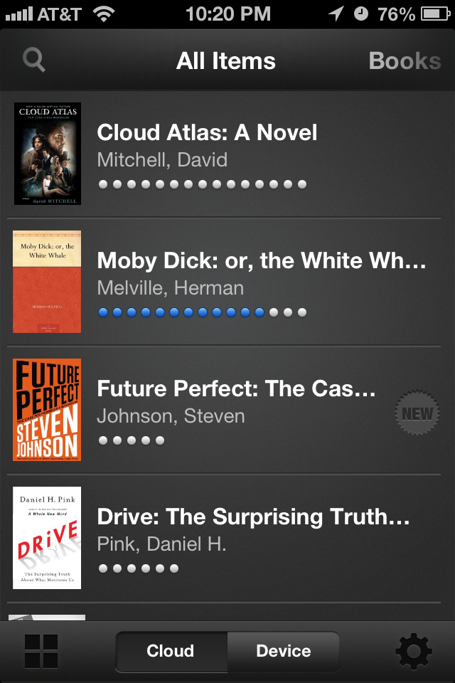
The Kindle home screen shows the books you've opened most recently.
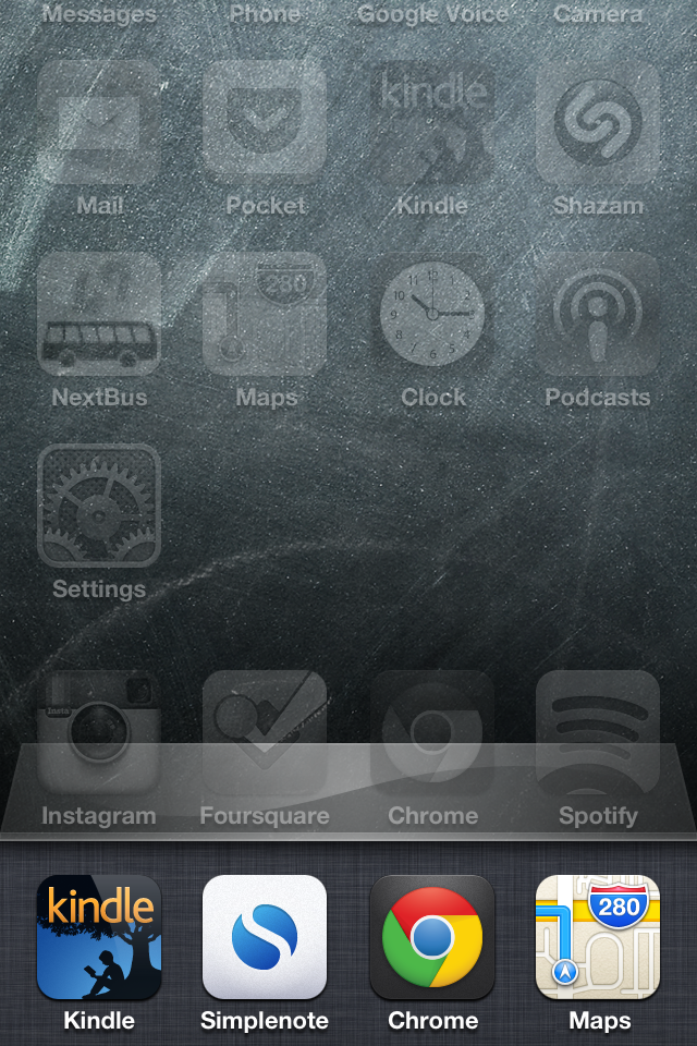
Double-clicking the iPhone's home button displays recently accessed apps. The Messages app displays threads in order of most-recently-edited.
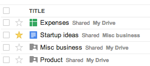
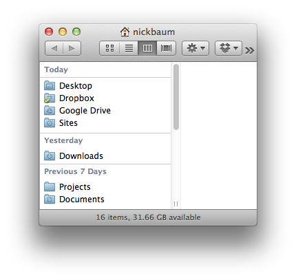
By default, Google Drive displays your documents in the most-recently-edited order.
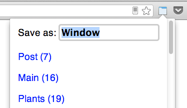
Personally, I've adopted the most-recently-opened pattern in my own extension Simple Window Saver. This has allowed me to maintain a super minimal interface.
Next time you're considering adding complex filterting, sorting or categorization to an app, consider whether most-recently-opened or most-recently-edited would be a simpler solution.